
EVENT LOGO. Posters and program cover for Partners Healthcare.
Logo idea. Studio Graphiko.
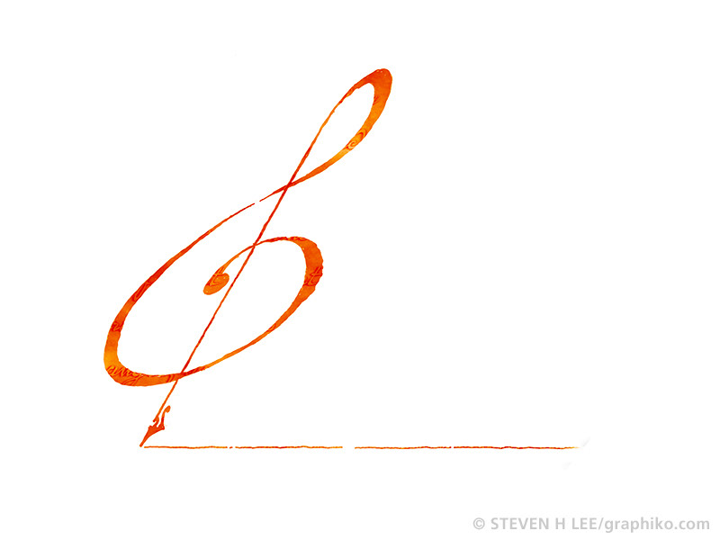
HARVARD WRITING PROGRAM, Harvard University English Department.
The focus was on writing about music, so a G clef, from musical notation, was combined with pen nib. The parchment like textures and variations in sepia color gave the mark an organic, handmade feel, like the manuscript of a piece of handwritten sheet music. The bold swirls of the G clef is meant to evoke the sway and swell of a piece of music.
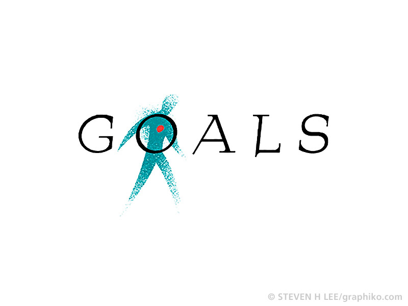
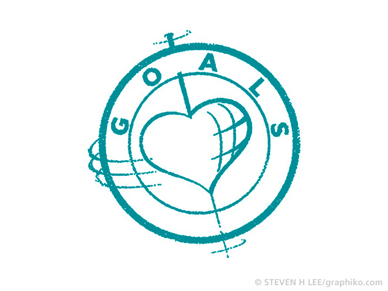
GOALS
Logo proposal for Dowden Health Media, a medical education and communications company.
Logo proposal for Dowden Health Media, a medical education and communications company.
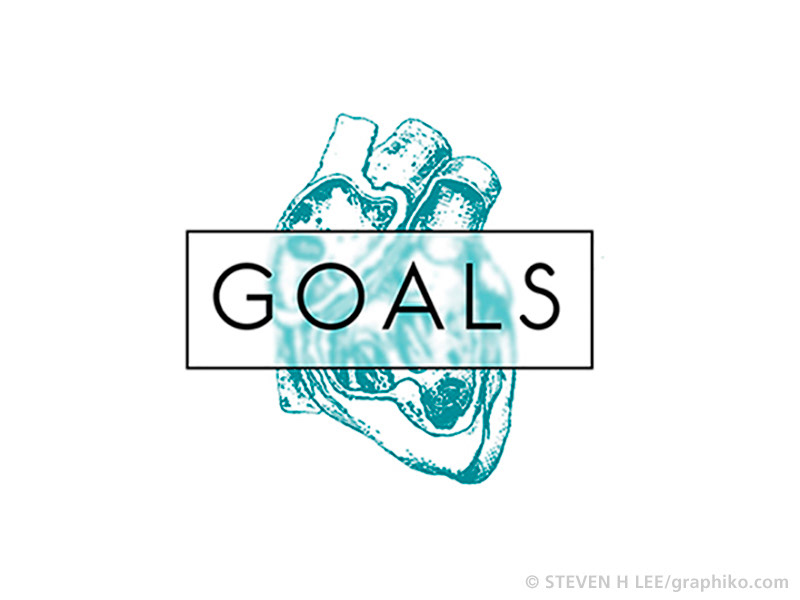
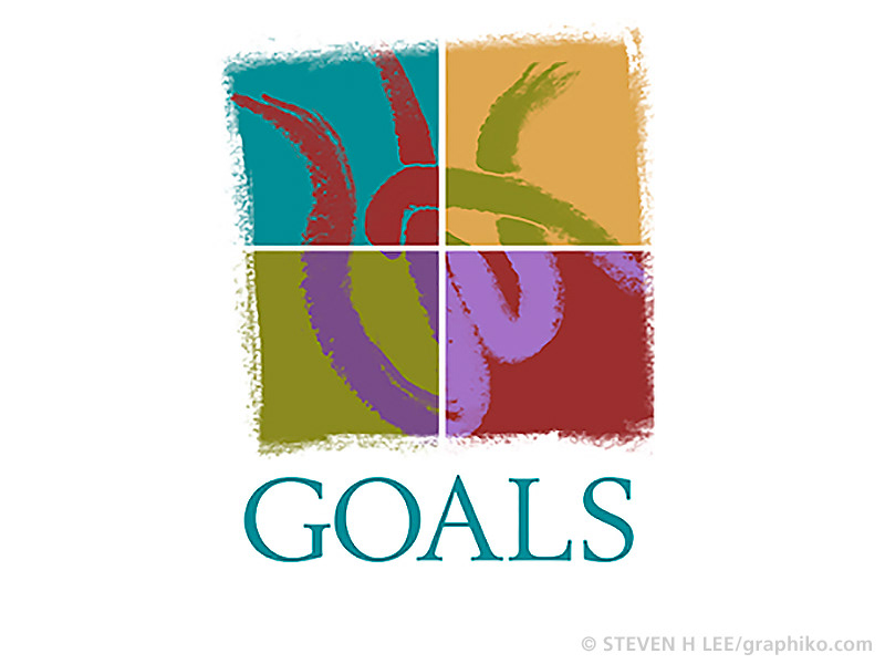
GOALS
2nd logo proposal for Dowden Health Media, a medical education and communications company.
2nd logo proposal for Dowden Health Media, a medical education and communications company.
DOWDEN HEALTH MEDIA
3rd logo proposal for the medical education and communications company.
3rd logo proposal for the medical education and communications company.
DOWDEN HEALTH MEDIA
4th logo proposal for the medical education and communications company.
4th logo proposal for the medical education and communications company.
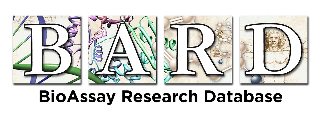
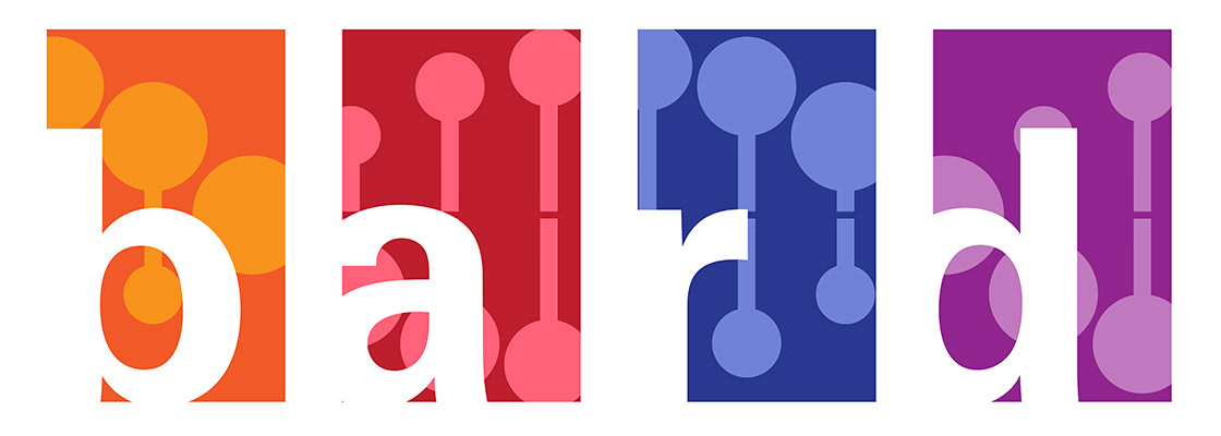
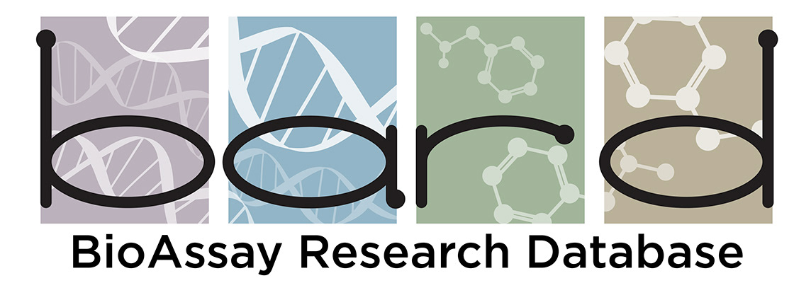
BARD
BioAssay Research Database. Final logo for multi-organization research project.
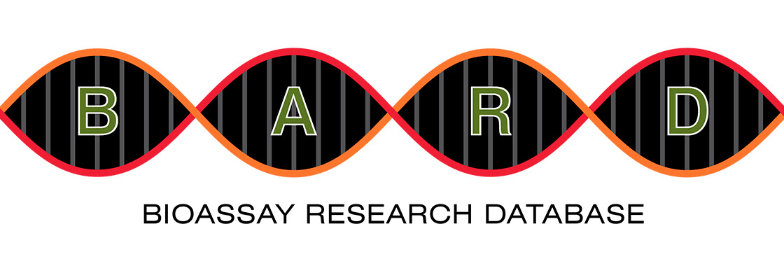
BARD
BioAssay Research Database. Logo proposal for multi-organization research project.
BioAssay Research Database. Logo proposal for multi-organization research project.
BARD
BioAssay Research Database. Logo proposal for multi-organization research project.
BioAssay Research Database. Logo proposal for multi-organization research project.
BARD
BioAssay Research Database. Logo proposal for multi-organization research project.
BioAssay Research Database. Logo proposal for multi-organization research project.
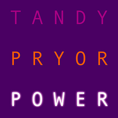
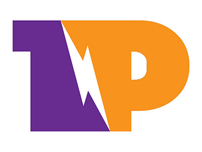
TANDY PRYOR
Logo proposal for Tandy Pryor, a business/empowerment consultant.
Logo proposal for Tandy Pryor, a business/empowerment consultant.
TANDY PRYOR
Logo proposal for Tandy Pryor, a business/empowerment consultant.
Logo proposal for Tandy Pryor, a business/empowerment consultant.
TANDY PRYOR
Logo proposal for Tandy Pryor, a business/empowerment consultant.
Logo proposal for Tandy Pryor, a business/empowerment consultant.
TANDY PRYOR
Logo proposal for Tandy Pryor, a business/empowerment consultant.
Logo proposal for Tandy Pryor, a business/empowerment consultant.

TANDY PRYOR
Logo proposal for Tandy Pryor, a business/empowerment consultant.
Logo proposal for Tandy Pryor, a business/empowerment consultant.
TANDY PRYOR
Skeuomorphic logo proposal for Tandy Pryor, a business/empowerment consultant.
Skeuomorphic logo proposal for Tandy Pryor, a business/empowerment consultant.

TANDY PRYOR
Logo proposal for Tandy Pryor, a business/empowerment consultant.
Logo proposal for Tandy Pryor, a business/empowerment consultant.
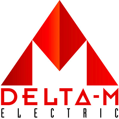
DELTA-M ELECTRIC
Logo for a local electrician. This was implemented across multiple platforms including stationary, web site, apparel and fleet vehicles. The logo is clean and bold, combining geometric typography with an aggresive pyramid form that plays of the name and meaning of the company name. The client was quite pleased with the logo and felt it lent a great sense of technical authority and confidence to his business.
Logo/mascot for TECHNIQUE MAGAZINE. Early trade publication that gave technical advise about graphic design and print communications targetted at in-house corporate media and public relations departments.
The mark consists of a character, exuberantly leaping forth and carrying aloft a computer cursor, with rays of ideas and inspiration shining out, framed within the rectangle of a computer monitor. This graphic is a visual symbol of the spirit, energy, and mission of Technique Magazine. It was successfully implemented to enthusiastic acceptance and became an iconic and well-loved mascot for the publication.
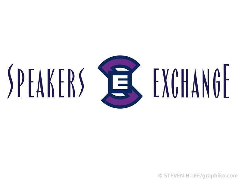
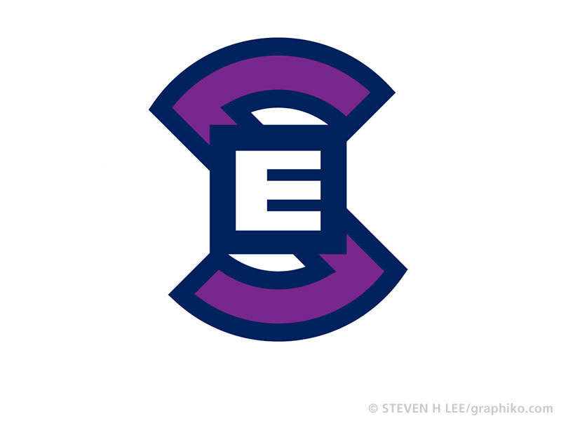
SPEAKERS EXCHANGE
Outreach program that dealt with sexual harrassment and dating violence in schools. The mission of Speakers Exchange was quite serious, and often dealt with incredibly sensitive issues, and the mark needed to connect to teenagers without being patronizing. The stylized letterforms, and medallion spoke to this need, combining strong, direct forms with more delicate lettering. The medallion is an abbreviation of the company name, but also hidden forms combine to form the word, SEX, and also partially forms the slashed circle symbol for "NO". Rather than an entreaty for abstinence, it is a call to THINK before you ACT.
Outreach program that dealt with sexual harrassment and dating violence in schools. The mission of Speakers Exchange was quite serious, and often dealt with incredibly sensitive issues, and the mark needed to connect to teenagers without being patronizing. The stylized letterforms, and medallion spoke to this need, combining strong, direct forms with more delicate lettering. The medallion is an abbreviation of the company name, but also hidden forms combine to form the word, SEX, and also partially forms the slashed circle symbol for "NO". Rather than an entreaty for abstinence, it is a call to THINK before you ACT.